To adapt to your graphic charter, it is possible to personalize the appearance of the language selector. For this, wpLingua offers many design options as well as the freedom to add your own custom CSS.
1 – Customize the switcher with design options
When you go to the wpLingua > Switcher tab, you find a screen with the different customization options. The Switcher Design panel gives you 4 types of options:
- Switcher theme
- Switcher style
- Displayed name
- Flag style
Let’s see this in detail…

1.1 – Switcher theme
This allows you to choose the color and border styles of the language switcher.
The color options offer 5 themes:
- Light: white color in the background of the switcher
- Grey: grey background color
- Dark: black background color
- Blur Black: transparent and blurred background color with black text and borders
- Blur White: transparent and blurred background color with white text and borders

Each theme is then broken down by shape and border style :
- Double – Smooth: the switcher will be framed by a double border with rounded corners.
- Double – Square: double border with square corners.
- Simple – Smooth: single border with rounded corners.
- Simple – Square: single border with square corners.
1.2 – Switcher style
These options allow you to define the layout of the languages in the switcher…
- Inline list: the languages are lined up next to each other.
- Block: the languages are placed in columns, one under the other.
- Dropdown: the languages appear in a drop-down menu; this is recommended when your site offers several languages.

1.3 – Displayed name
These options allow you to choose how the language name should be written in the switcher.
- Translated name: the name of the languages is translated into the original language of the site.
- Original name: each language retains its name in its own language (English, Français, 日本語, Português, Español, etc.)
- Language ID: language names use language ID (FR, EN, DE, RU, etc.)
- No display: no text, only flags are displayed.

1.4 – Flag Style
These options allow you to choose the appearance of the flags in the switcher.

- Circle will display round flags
- Rectangular will display rectangular flags
- Wave will display wavy flags
- No display will not display any flags, only the language name will be displayed
2 – Customize the flag of the switcher
Beyond the shape of the flags, you can also choose the flag to display by language. This may be a desire to use a flag other than conventional flags. For example, you can use the flag of the United States or Australia for the English language, instead of the flag of Great Britain. Or that of Canada or Belgium for the French language, instead of the flag of France… This is possible!
2.1 – Choose your flag preference
- Go to wpLingua > wpLingua tab.
- Click Edit Flag.
- Select your favorite flag and don’t forget to save your changes.
- It is also possible to use a personalized flag that you import upstream into your media library.

2.2 – Use custom flags
To use custom flags, you must first import them into your media library, as follows:

- Go to Media > Library tab and click Add New Media File.
- Import your flag then click on it to open the media. Now, you can click Copy URL to clipboard.
- Go to wpLingua > wpLingua tab to paste the custom flag URL. Save changes.
- Now your switcher displays the new flag.
Repeat for each language if necessary.
3 – Customize the switcher with CSS
If you want the design of the language switcher to match your graphic charter, you can personalize it with custom CSS. Of course, you will need to have some knowledge of CSS, although below we will give you some tips, ideal if you are new to CSS.
3.1 – Inspect the browser console
The browser console is your best friend. It will help you test the personalized CSS and see its visual rendering live. Here’s how to do it:

- Visit the front end of your site from your browser and right-click, then choose the Inspect option. Here is an example with Firefox, but other browsers work in much the same way.
- Click the arrow icon. This tool allows you to easily select the item to inspect. By the way, use it to inspect the language switcher (click the language switcher after clicking the Arrow tool).
- To the left of the console is the HTML code, you can navigate to select other HTML tags if needed.
- To the right of the console is the CSS code. Even if you’re not a CSS whiz, you can easily change the appearance in real time. For example, change the hexadecimal color code of border colors, texts or backgrounds… Don’t worry, the changes are not taken into account, it’s just to test the appearance, when you reload the page, the site returns to its initial state. Take the opportunity to modify the switcher according to your preferences.
- In real time, you visualize the new appearance of the language switcher according to your CSS modifications.
3.2 – Bring the CSS code into the wpLingua settings
Once you have found the ideal CSS code to personalize the language switcher, you can directly copy it into the browser console then paste it into the wpLingua settings in the wpLingua > Switcher > Custom CSS tab.
As soon as the CSS code is entered in the dedicated field, you should see the result in the switcher preview.
Don’t forget to save your changes.

3.3 – Some useful CSS snippets
To help you out, we thought these few CSS code snippets might help:

First of all, note that the CSS class .switcher-content allows you to act on the entire block of the language switcher while the class .wplng-langague allows you to act on the languages themselves.
For this example, the switcher was defined with the theme Light – Double – Square. To change the background and border colors of the switcher, here is the CSS:
.wplng-switcher.theme-light-double-square .switcher-content {
  background-color: #5e33d9;
  border: 1px solid #5e33d9;
}
To change the background and border colors of languages, here is the CSS:
.wplng-switcher.theme-light-double-square .switcher-content .wplng-language {
  border: 1px solid #5e33d9;
  color: #5e33d9;
}
But if you had chosen the Light – Simple – Smooth theme for example, you will notice that one of the CSS classes changes (.theme-light-simple-smooth), so take this into account when making your modifications (hence the importance of using the browser console to search for the right CSS classes). Here is the code you should use:
.wplng-switcher.theme-light-simple-smooth .switcher-content {
  background-color: #5e33d9;
  border: 1px solid #5e33d9;
}

.wplng-switcher.theme-light-simple-smooth .switcher-content .wplng-language {
  background-color: #ffffff;
  border: 1px solid #5e33d9;
  color: #5e33d9;
}
Otherwise, to avoid targeting all CSS classes, you can simplify the code in this way without forgetting to add !important for certain rules. The result will be the same:
.switcher-content {
  background-color: #5e33d9 !important;
  border: 1px solid #5e33d9 !important;
}

.wplng-language {
  background-color: #ffffff !important;
  border: 1px solid #5e33d9 !important;
  color: #5e33d9 !important;
}
In this way, you can change everything that the CSS code allows: add shadows, transitions, states on mouseover, etc.
/* add a shadow to the switcher */

.switcher-content {
  box-shadow: 5px 5px 0px 0px #5e33d9;
  transition: 500ms ease;
}
/* obtain a rounded switcher */
.switcher-content {
border-radius: 100px;
}And to finish with the custom CSS code, here is the one used on our site:
.switcher-content {
  box-shadow: 8px 8px 0px 0px #bcfa99;
  transition: 500ms ease;

}

.switcher-content:hover {
  box-shadow: 10px 10px 0px 0px #bcfa99;
}

.switcher-content .wplng-languages .wplng-language:hover .language-name {
  color: #bcfa99;
}
4 – Choose the location of the language switcher
Now that your language switcher is fully customized, it’s time to define its location on your site!
4.1 – Display language switcher automatically
Go to the wpLingua > Switcher > Switcher insertion tab to choose a predefined location.
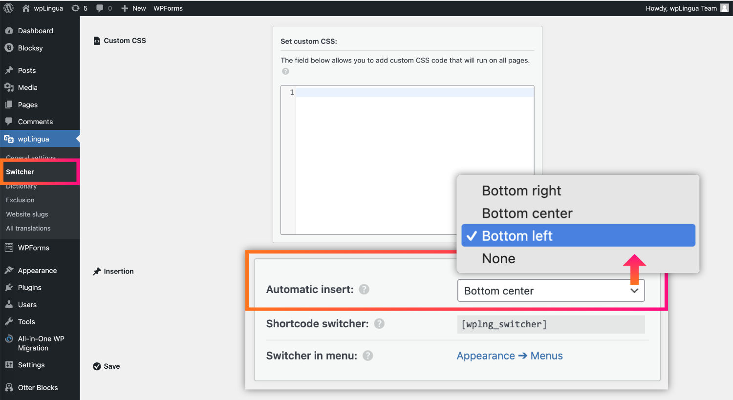
If you choose Automatic Insert, the language switcher will appear:
- Bottom right of your website
- Bottom center
- Bottom left
- None
No need for additional explanations here because the options are quite self-explanatory.
4.2 – Insert language switcher manually using a shortcode
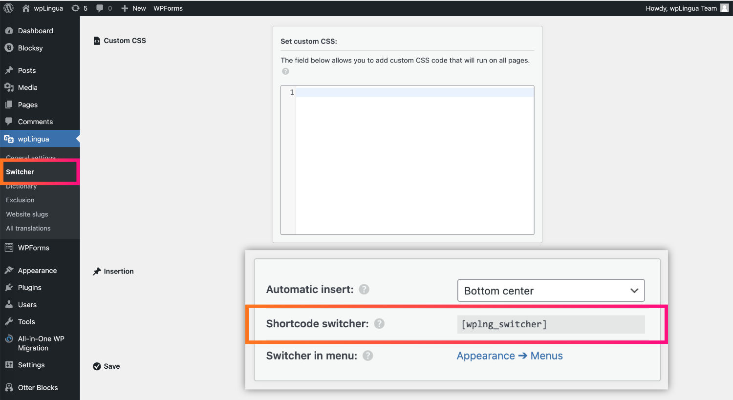
If you want to insert the language switcher only in certain places on your website, you can use the shortcode provided for this purpose.
4.3 – Insert language switcher in Nav Menu of a classic theme
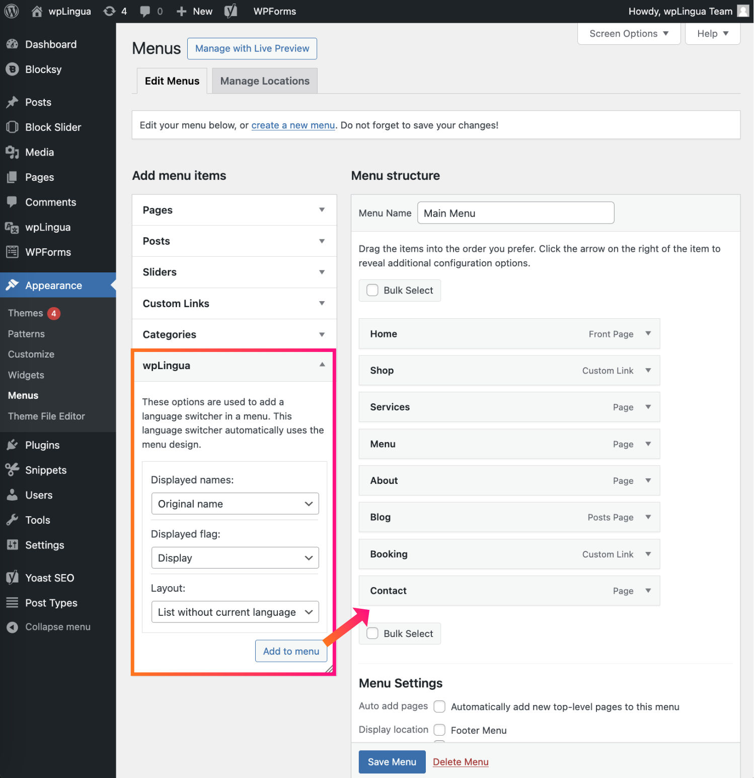
To insert the language switcher into your classic theme’s menu, simply go to the Appearance > Menu tab and insert the wpLingua widget.
You have a few display options to configure.
Concerning the design, the language switcher retrieves that of your theme.
4.4 – Insert language switcher in Nav Menu of a Block theme
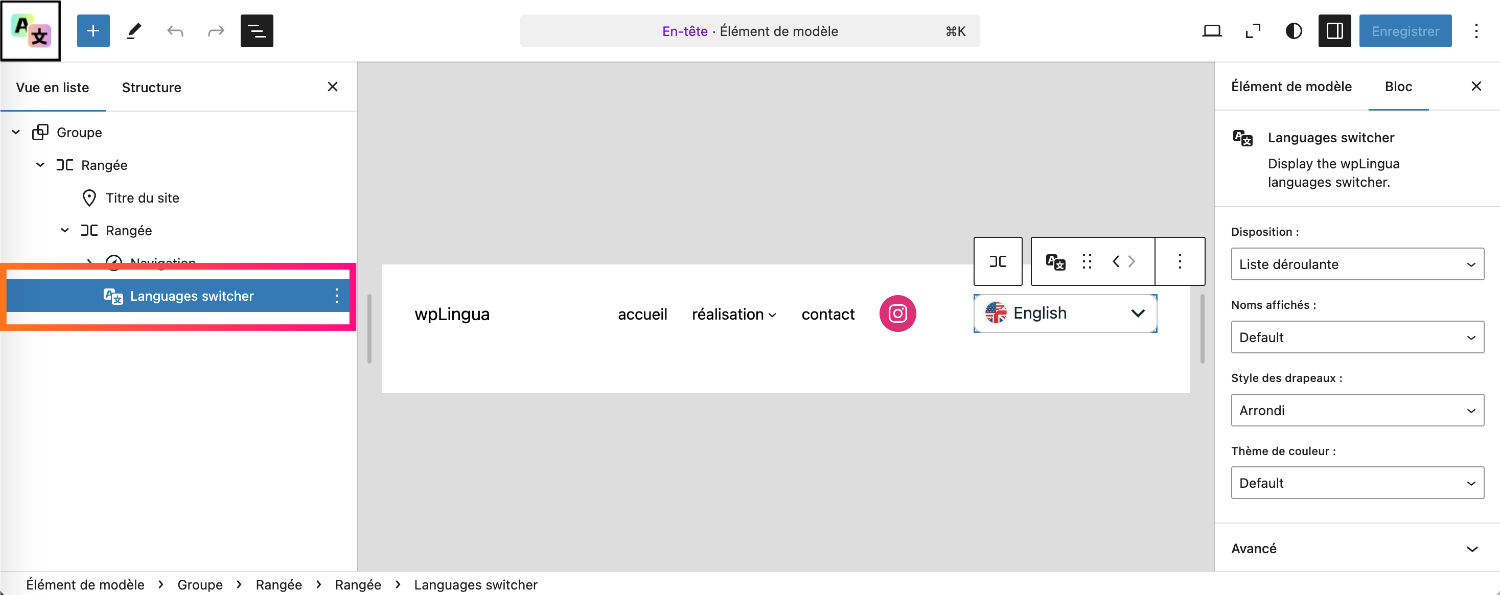
If your website uses a block-based theme (like Twenty Twenty Five, Neve FSE, etc.), you can easily edit the website header via the Editor to add the Language switcher block in the location of your choice.
5 – Fully customize the language switcher with wpLingua!
We hope this guide has provided you with a clear and comprehensive understanding of customizing the language switcher in wpLingua.
Remember, the flexibility and customization options offered by wpLingua are designed to ensure that your website not only communicates effectively in multiple languages but also maintains a cohesive and engaging aesthetic.
Should you have any further questions or require additional assistance, our support team is always here to help. Your feedback and insights are invaluable to us as we continually strive to improve wpLingua.


